Color-Coordinated Wardrobe Made Easy: Palette & Outfits
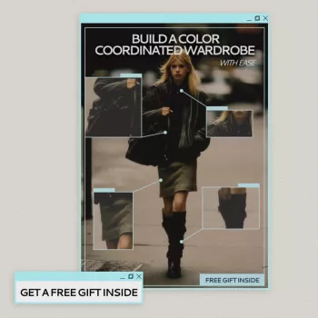
Build a Color-Coordinated Wardrobe with Ease: Personal Palette, Outfit Matching, and Smart Styling
A color-coordinated wardrobe reduces decision fatigue, helps outfits look intentional, and makes shopping simpler. With a clear personal palette and a few repeatable outfit formulas, everyday dressing becomes faster—without feeling repetitive or restrictive.
Why Color Coordination Makes Getting Dressed Easier
When most of what you own “speaks the same color language,” outfits come together with less effort. Instead of starting from scratch each morning, you’re mixing pieces that were designed (by you) to cooperate.
- Fewer “nothing to wear” moments when most pieces work together
- More outfits from fewer items by repeating a consistent color story
- Simpler shopping: new pieces are evaluated against a defined palette
- A more polished look even with casual basics because colors harmonize
If you’ve ever put on great individual items that still look “off” together, it’s often not the fit—it’s competing undertones, intensity, or contrast. A palette solves that by narrowing choices in a way that still feels personal.
Find Your Personal Palette (No Guessing Required)
A personal palette isn’t about rules; it’s about repeatability. Start by organizing colors into three working groups:
- Neutrals (base): the backbone—pants, outerwear, shoes, bags
- Core colors (most-worn): what you’ll happily wear weekly
- Accents (small doses): the “spark”—a scarf, earrings, a statement knit
Use everyday cues
- Pull your favorite tops and note the colors you reach for first.
- Write down the shades that get compliments and the ones that photograph well on you.
- Look at your go-to makeup, jewelry metal, or hair color—these often hint at what harmonizes.
Check undertone and contrast
Most wardrobes get stuck because of undertone mismatch (warm beige fighting cool gray) or contrast mismatch (high-contrast outfits feeling harsh, or tonal outfits feeling flat). If you want a quick refresher on how hue, value, and saturation work together, Color Matters’ color basics is a clear, practical reference. For trend direction and widely used color language, the Pantone Color Institute is a helpful resource.
Aim for a repeatable palette
A strong starting point is 2–3 neutrals, 4–6 core colors, and 2–3 accents. That’s enough variety to keep outfits interesting while still making mixing automatic.
| Palette role | Color options | Best used for | Easy pairings |
|---|---|---|---|
| Neutral base | Black, charcoal, navy, cream | Pants, jackets, shoes, bags | Works with all core colors |
| Core colors | Denim blue, olive, burgundy, soft white | Tops, knits, casual dresses | Pair with any neutral base |
| Accent colors | Cobalt, fuchsia, teal, gold | Scarves, jewelry, statement tops | Use with 1 neutral + 1 core color |
| Print strategy | One print that includes 2+ palette colors | Skirts, blouses, accessories | Treat print as a “color bridge” |
Closet Edit: Keep What Fits the Palette (and Let the Rest Go)
A closet edit doesn’t have to be dramatic to be effective. A fast, low-stress approach is to sort into three piles:
- Fits palette: keep in rotation
- Almost: close, but needs a plan
- No longer: donate/sell/store
Then identify the most common mismatch:
- Wrong undertone: warm item with cool wardrobe (or vice versa)
- Too bright or too dull: the saturation sticks out
- Hard-to-pair shade: a “lonely” color that doesn’t echo anywhere else
“Almost” pieces can often be rescued by dyeing darker, tailoring for better proportions, or pairing with a bridging print that contains both the tricky shade and one of your neutrals. Also, limit duplicates in off-palette colors; duplicates only earn space when they’re true workhorses.
Build Outfit Formulas That Always Work
Outfit formulas remove the guesswork while still leaving room for personal style.
- Use a 3-color rule: 1 neutral + 1 core color + 1 accent (or a second neutral).
- Try tonal dressing: multiple shades in one family (cream + camel + chocolate) reads elevated and intentional.
- Balance intensity: a bright accent looks purposeful when the rest of the outfit is quieter.
- Repeat silhouettes, vary color: keep a trusted fit (straight jeans + knit) and rotate palette-friendly hues.
A reliable example: navy trousers (neutral) + olive top (core) + gold earrings (accent). You can swap the top to burgundy and keep the rest, and the outfit still “works” because the framework stays consistent.
Smart Styling Tricks for Instant Coordination
Make Shopping Easier: A Simple Color Checklist
eBook Guide: Build a Color Coordinated Wardrobe with Ease
If you want a structured way to define your palette and turn it into repeatable outfits, Build a Color Coordinated Wardrobe with Ease (eBook guide) walks through personal palette building, outfit matching, and smart styling habits designed to reduce overbuying and increase outfit repeatability.
Finish the Look: Accessories and Footwear That Tie Outfits Together
Two easy building blocks to consider: Dr. Martens Women’s White Ankle Boots can brighten neutral-heavy outfits, while the Armani Exchange Black Women’s Handbag is a classic anchor that pairs with nearly any core color story.
FAQ
How many colors should be in a personal wardrobe palette?
A practical range is 2–3 neutrals, 4–6 core colors, and 2–3 accents. Fewer colors makes matching easier, while this mix still gives plenty of variety.
What if a favorite color doesn’t flatter or doesn’t match anything?
Use it as an accent (scarf, bag, nails) so it doesn’t have to carry the whole outfit. You can also try a warmer/cooler version of that shade, or choose a print that includes both your favorite color and one of your neutrals to bridge the look.
How can outfits look coordinated without wearing matching sets?
Rely on a repeatable formula like neutral + core + accent, and “echo” one color through accessories or hardware. Consistent metals and a primary shoe/bag neutral also create cohesion even when the pieces aren’t a set.








Leave a comment